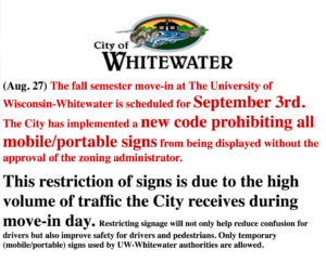
 Last week I wrote about the differences between a City of Whitewater announcement and the Whitewater Banner‘s reworking of that same message. See One City, Two Presentations of the Same Regulation. A local reporter shared some thoughts with me about the relationship between the municipal government and the Banner.
My main contention was that the Banner‘s reworking was amateurish, and somewhat more hectoring, than the municipal version. The local reporter pointed out that, most likely, city officials saw an advantage in the Banner‘s version: it delivered the sterner message that they probably wanted to deliver (but that they knew would be unprofessional & off-putting). The use of the city’s logo above the message seemed the clincher, as the reporter followed up to say that other municipalities would have fought against the use of the logo in a re-worked message (and have sometimes done so). Either Whitewater hasn’t done so, or has done so only ineffectually.
(As you can see in the versions that embedded below – click for larger images – the Banner‘s version changes the words and style of the city’s original but still places the altered version under the imprimatur of a municipal logo.)
Under my assessment, the Banner‘s version was of lesser quality than the original. There’s another way, however, to look at this, beyond the idea of a less competent version of an original: perhaps the city wanted a second version, to drive home a restriction more bluntly (if also more awkwardly, with disparate fonts and different usage).


