 Small towns are meant to be (or at least are depicted in Hollywood as) simple, unassuming places. That’s not always true, to be sure — the same information can be presented in more than one way. There’s a place for look and feel, for style and manner, for how a town presents itself to its own residents and the world beyond.
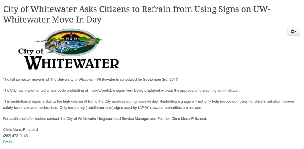
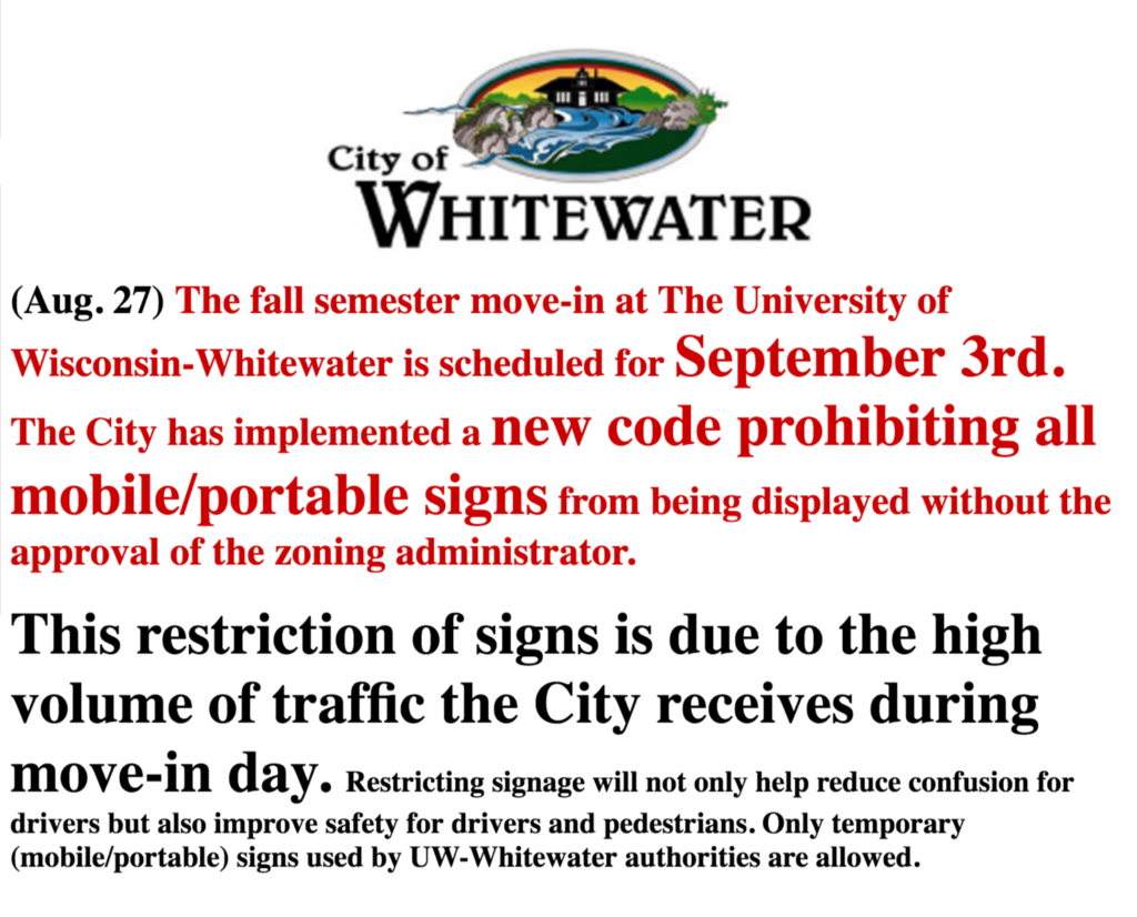
No better illustration of the difference between Old and New Whitewater (states of mind, not ages or individuals) is found than in how the City of Whitewater and the Banner, a politician-publisher’s website, present information on a regulation against temporary signs. (Quick note: here I’m addressing style of presentation, not the underlying merit or stated motivations for the regulation.)
Each image expands into a larger window when clicked —
Here’s how the municipal government presented a sign regulation on its website:
Here’s how the longtime politician’s website presented the city’s sign regulation:
These aren’t, to be sure, the same message, and illustrate the way that presentation changes meaning. Style affects communication: go, Go, GO, GO, and GO convey different meanings.
Indeed, there’s a way in which the older style leaves in doubt the success of the city’s efforts to project a more modern, business-standard presentation.


